


Clustering Pitchers!
Twas the night before opening day...


The following analysis is a clustering exercise on Statcast era pitching data as a way to identify pitchers that are undervalued in a season, and to see if they bounced back in the following season. It is also my take on a research article by Tatsuya Ishii Using Machine Learning Algorithms to Identify Undervalued Baseball Players, where he also used clustering to find undervalued pitchers in the MLB.
I plan to deviate from Ishii's article by tweaking two major features. Instead of computing an ERA differential, I plan to compute a FIP differential because its defense-independent for the pitcher. I also want to do a PCA to reduce the data down to two principal components that will do the clustering. This option is for the sake of having a simple plot to look at rather than a variety of pairwise plots.
The goal of this study is to utilize K - Means clustering to identify underperforming pitchers in a cluster and to see whether or not they rebounded in the subsequent year, if this were to happen, then these players are considered undervalued in that subsequent year due to their performance in the last.
What does undervalued mean in this analysis? Being undervalued for a season is having a bad season one year, then bouncing back the consecutive year. This would imply that the bad season was an off season for the pitcher, or that the pitcher just greatly improved in the consecutive season.
What is Clustering?
An unsupervised ML algorithm that groups observations based off of certain similarities (classifying the data for us). The amount of groups, clusters, are determined before the run of the algorithm, and each group will have a centroid, which is the center of the cluster. Every data point is allocated to each of the clusters through reducing the in-cluster sum of squares. There are various heuristics to determine the amount of groups, a popular one being the elbow method which is a method that aims to minimize the sum of squared errors relative the cluster mean for ever K = 1, 2, 3, ... . In this analysis, I do not use the elbow method to determine the number of clusters, I instead do it via intuition to get a properly granularize set of clusters
What is PCA?
For the purpose of having a fancy visualization, I use PCA to reduce the column dimension of our data to two. PCA dimension reduction method that allows for the reduction of computation time and visualization among high dimensional data. More specifically it is a statistical technique used to reduce the dimensionality of a data set while retaining as much information as possible. It does this by identifying the directions in which the data varies the most, and then projecting the data onto a new set of dimensions that are orthogonal to each other. These new dimensions, called principal components, are ranked by the amount of variation they capture in the data. The first principal component captures the most variation, the second principal component captures the second most, and so on.
In this analysis we have 12 dimensions of meaningful data, thus visualization is impossible, so PCA to visualize would be useful.
It's worthy to note that PCA is a black box analysis, because the two variables we retrieve from it won't be interpretable, it's strictly there for visualization.
Data
The data for this analysis were extracted from FanGraphs.com and BaseballSavant.com. The dimensions of our dataset is 303 rows and 14 columns, where each row represents a pitcher, and each column is indicative of the following ...
player_name - Name of player.
player_id - identifying no. of player.
wOBA - Average wOBA against that pitcher.
xwOBA - Average xwOBA against that pitcher.
launch_speed - average initial velocity of pitched ball.
launch_angle - average Angle of ascent of batted ball.
spin_rate - average rate of rotation around a pitched ball's axis across the various repertoire of pitches the pitcher has in RPM.
velocity - average velocity of pitched ball through the strike zone.
effective_speed - Derived speed based on the the extension of the pitcher's release.
eff_min_vel - effective_speed - velocity, to indicate deviation between the two.
release_extension - quantifies exactly how much closer a pitcher's release point is to home plate
W - No. of wins the pitcher received that season
FIP - Fielding Independent Pitching
WAR - Wins above replacement
We restrict our analysis to pitching data due to the richness of pitching data available relative to hitter data. Pitching data has a variety of variables readily available such as spin rate in RPM, break angle, pitch movement, pitch classification, release extension and more. These data attributes will be received from baseballSavant.com in the form of a csv file for the 2021 season, and we can see whether or not the underperforming pitchers did well in the 2022 season. We will also filter pitchers by examining only those who have thrown at least 50 innings in the season, because this is standardized across many pitcher analyses.
FIP is the most important statistic in our dataframe, because it is what we will be using to identify the undervalued players, and generate a differential to quantify the degree of undervalued-ness.
Due to the nature of clustering, all the data will be scaled/standardized with zero mean and unit standard deviation.
Our data aims to keep the scope of the pitcher's metrics within the pitcher himself, therefore, we don't use data that relies on the outcome of a ball in play (except the rate metrics that rely on those), only the metrics that are controlled by the pitcher.
Model Scheme
The goal is to run a K-means clustering on our data and provide relevant visualizations that display the clusters. The hard part behind any form of clustering is to make meaningful clusters that accurately capture the observations; for us we want clusters that classify 'excellent' pitchers, and 'poor' pitchers, which may be divided up into more than a binary classification.
We will utilize the sklearn.cluster module to run clustering algorithms and scaling functions, the pandas for dataframe manipulation, matplotlib for visualization, and numpy for numeric computation.
After we have the clusters, we compute a FIP differential for the 'excellent' clusters to determine the undervalued players. I'll pick 8 total pitchers and utilize their pitching analytics, and outside data, to see precisely why this pitcher is underperforming. I create ten clusters, but only focus on the top 4 clusters.
Once we have that analysis, we can compute their WAR/IP between the 2021 season (the season we're analyzing) and the 2022 season to see if there was a significant rebound. We use WAR/IP, to standardize all pitchers whether or not they’re relief players or starters.
Then to visualize the clusters, I will run a PCA on my dataset with two principal components, and then graph the centroids on the 2 dimensional scatter plot.
Modeling
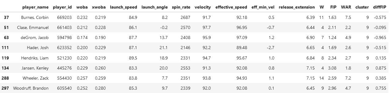
After the modeling and code has been done, we get four clusters, which are the following…
The pitchers in this cluster are all famous in 2021 – amazing pitchers. Zack Wheeler, Emmanuel Clase, and Corbin Burnes are incredible pitchers and the best of the MLB, however, two of these players in this cluster do not receive a whole lot of coverage. Kenley Jansen and Brandon Woodruff would be those who are considered underperforming in this cluster.
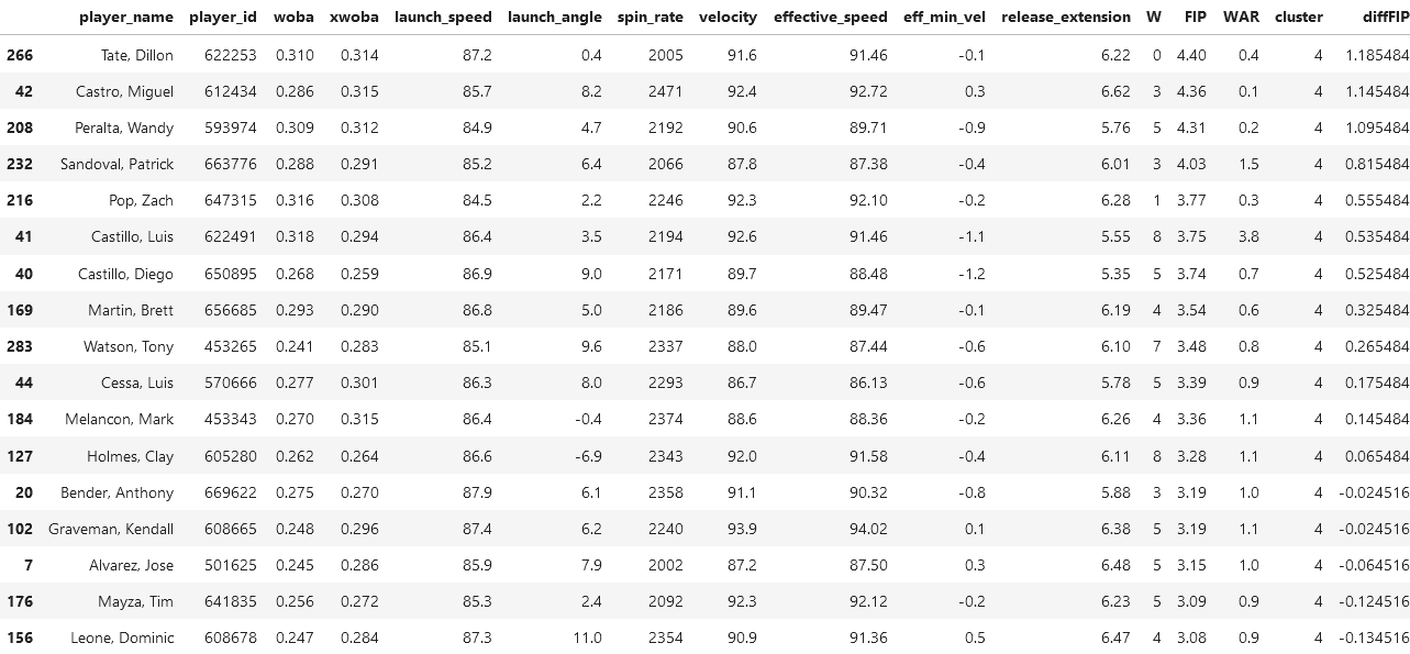
These are pitchers who are far less famous than those in previous cluster, but there are some familiar faces here such as Richard Bleirs (not in this screenshot at least) of the Baltimore Orioles who is known for getting three balls, then proceeding to get three strikes. There's also the likes of Blake Treinen who isn't known as an MLB all star, but to Dodger fans (such as myself) he's very much liked.
The players who we will be picking to analyze will be Dillon Tate and Miguel Castro, because they have the highest FIP differential.
It is also interesting to note that Miguel Castro has an average spin rate of 2471 RPM, which is incredible, and of the same capability as those in cluster 9. Other than that, both Castro and Tate have metrics expected of their cluster.
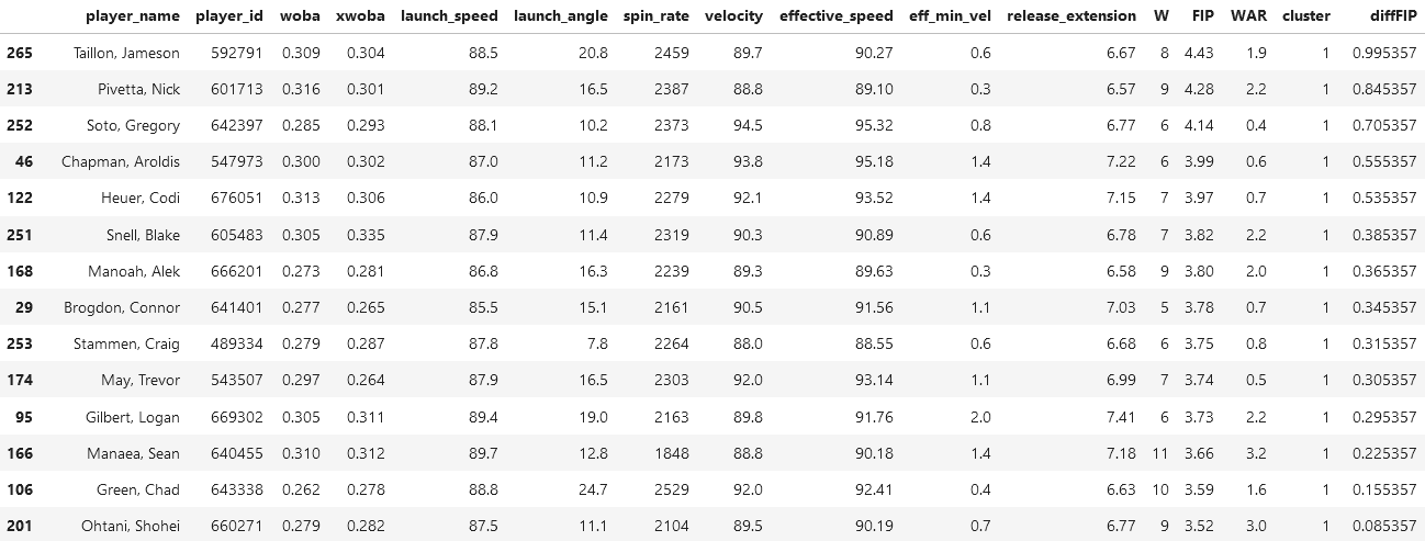
By inspection of the players on this list, we see super stars, but not of the caliber we see in the first cluster. Superstars like Alek Manoah, Shane McClanahan, and Shohei Ohtani are great pitchers, and known legends on their teams. If we inspect the spin rates and WAR of this dataframe, we see it to be higher than those in the second cluster.
We will select Jameson Tallion and Nick Pivetta to analyze, because they lie in the bottom of their cluster.
An interesting quirk about Tallion is that he has a very high spin rate at 2459 RPM, a lot like Miguel Castro, but has relatively low speed in the variety of facets: launch speed, velocity, and effective speed, are all somewhat low given his high spin rate.
The only thing interesting about Pivetta is his WAR, because if we were to compare it to the average WAR in this cluster, it would come up higher than average.
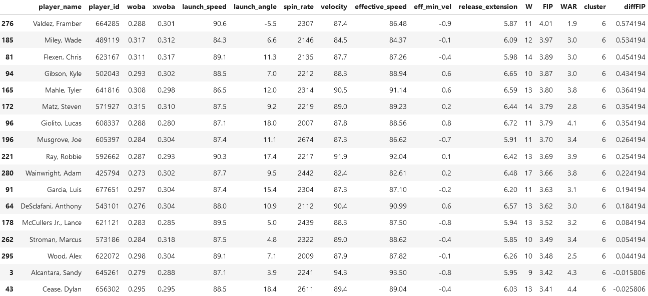
This cluster is interesting because it has those who are considered incredible/legends across their career, but not in the 2021 season. A perfect example of this is Clayton Kershaw (my favorite player!) who is in this cluster, and has three Cy Young awards between the 2010-2015 seasons (a Cy Young award means to be voted the best pitcher of a league). So I would classify this cluster as second in performance to the first cluster.
There are many legends on this list, so we will be selecting those who are NOT, and are at the bottom of the ladder in terms of their FIP: Framber Valdez, and Wade Miley.
By inspection of both Valdez's and Miley's statistics, they don't really seem too in control of the game, because they have pretty low metrics across the board. Their wOBA and xwOBA are too high, and their speed metrics are low as well.
So in terms of performance it seems that Cluster 1 > Cluster 4 > Cluster 3 > Cluster 2.
Player Analysis
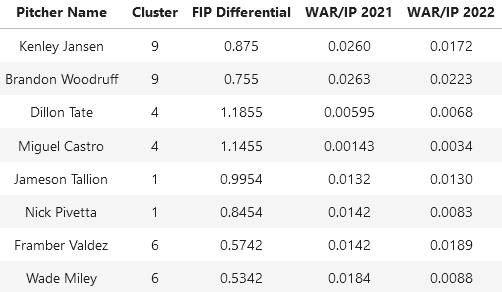
The above table retrieved data from FanGraphs.com.
By inspection of those we selected in the prior analyses, we note two things
Those in the same cluster have a very similar FIP differential
Those in the same cluster have a very similar WAR/IP in 2021, but not necessarily in 2022
Generally we don't see a trend of identifying undervalued-ness in this scenario, because their WAR/IP in 2022 was either around the same as the prior year or less. This means that generally, a high differential doesn't imply that there will be a rebound in the following season. Some players are to note such as Dillon Tate and Miguel Castro of cluster 4, which is interesting because we determined that cluster 4 was the most unskilled.
Miguel Castro shows the most improvement out of everyone in the table, and he showed promise in terms of his spin rate and pitch velocity.
But overall from this analysis, we cannot determine undervalued-ness from FIP differentials in K - means clustering, because we generally see underperformance in 2021 and 2022.
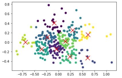
PCA
With the dimension reduction, we get the plot below, 12 dimensions mapped unto 2 dimensions. The reason why this is useful is because the PCA encapsulates most of the data and is also two dimensional, which is great for plotting.
Here we see the traditional output of a K - Means clustering plot, where our clusters seem to be well refined. Generally the clusters are localized around their cluster, and this is good, because it implies 10 centroids is adequate enough for this cluster analysis. It would seem that the clusters that lie on the edge of the scatter plot tend to be more dispersed, which might encourage further increasing of K. (It should me mentioned that due to the black box nature of PCA, the x and y axes don't have any actual meaning. It somewhat be interpreted as a conglomeration of the 12 dimensions of meaningful variables we had initially).
Conclusion
All in all we've determined that we cannot detect players who are undervalued because of their underperformance in one year from this analysis. It might prove useful to increase the amount of centroids to get more defined cluster edges, then to rerun our analysis.
Some improvements to this model scheme might be in the form of...
Running a LASSO/L1 regression (FIP ~ . ) because we can determine if all of our variables are actually significant when it comes to predicting our desired metric, FIP. This would allow us to do an early and interpretable dimension reduction.
To use a Gaussian mixtures approach alongside the K - Means algorithm. This is because Gaussian mixtures adds an uncertainty measure along with assignment to a cluster, which could help our selection of which players to analyze their WAR/IP.
Notes
I’m back! I’ve had a lack of motivation to write when the baseball season wasn’t in session, but now that it’s back, I’m here to write!
Over the pass few months I’ve been training in the ways of machine learning and modeling, so if you liked this type of ML analysis, more will come your way.
This season I’m looking at a couple teams, Dodgers (of course), Phillies, Guardians, and the Orioles.